# Meet.coop Logo Design
**URL:** https://forum.meet.coop/t/meet-coop-logo-design/48
**Category:** Brand design
**Tags:** prod, time-deliberating
**Created:** [28 May 2020 12:49 UTC](https://forum.meet.coop/t/meet-coop-logo-design/48 "2020-05-28T12:49:15Z")
**Posts on this page:** 15
**Page:** 3
### Author:  [@mikemh](https://forum.meet.coop/u/mikemh)
#### Post date: [17 November 2021 12:11 UTC](https://forum.meet.coop/t/meet-coop-logo-design/48/41 "2021-11-17T12:11:14Z")
@wouter 's screenshots above are helpful. The landscape-format implementation in the forum header is a good model to follow: icon top-left, plus text `The online meeting cooperative`
Q: As an element within a landscape-format logo, how does the main text ‘[meet.coop](http://meet.coop)’ - as in examples 1-5 above - combine with the strapline `The online meeting cooperative`, which I assume (?) we will continue to use? [Above](https://forum.meet.coop/t/meet-coop-logo-design/48/36) I offered a three-part combination of graphic PLUS text x2 (where text x2 = main text PLUS strapline). Is this an acceptable format?
Q: Should the basic set of icons include both a landscape **and** a portrait implementation of iconPLUStext? Or just landscape as above? The portrait format would have two elements (graphic, text x2) stacked, while the landscape format would have them side-by-side.
Agreeing with Wouter as regards the typefaces. I’m OK with a conventional sans serif font as in the screenshots of the Forum icon or in the Greenlight page header (possibly in bold, as in the Forum header screenshot). We should only (?) depart from these norms if there’s a font that has some distinctive character that we REALLY love. I don’t feel that any of the fonts in examples 1-5 above are really loveable. (Example #1 may be closest but too bold, overpowering the graphic element.)
---
### Author:  [@osb](https://forum.meet.coop/u/osb)
#### Post date: [23 November 2021 10:57 UTC](https://forum.meet.coop/t/meet-coop-logo-design/48/42 "2021-11-23T10:57:31Z")
Hi All,
Thanks for the feedback 🙂
I’m not sure we need to stick to the full name “The Online Meeting Cooperative” for the logo…
To me the full name is more like the company name, which might be used in ‘official’ situations / communications, but I don’t think it needs to be part of the logo.
Here’s some examples of the two:
and in situ on the home page, with the letters reversed into white:
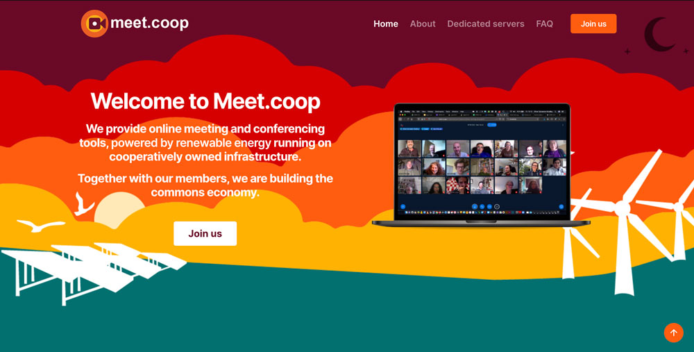
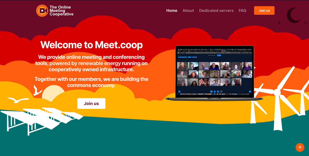
If we drop the capital M in [meet.coop](http://meet.coop) we should probably also drop it in the explanatory text below on the home page - and elsewhere throughout the website and all other comms.
Landscape and portrait orientations would be good … but the dot in [meet.coop](http://meet.coop) unbalances it slightly:
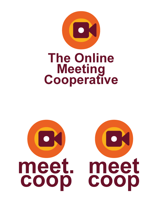
Any thoughts?
I’m still not convinced we should stick to Arial as the font - anything else would be preferable imho!
Here’s some examples using the ‘phosphate’ font:
and in situ on the home page:
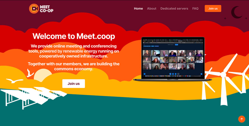
---
### Author:  [@mikemh](https://forum.meet.coop/u/mikemh)
#### Post date: [23 November 2021 17:33 UTC](https://forum.meet.coop/t/meet-coop-logo-design/48/43 "2021-11-23T17:33:35Z")
> [@osb](#):
>
> I’m not sure we need to stick to the full name “The Online Meeting Cooperative” for the logo
Agreed
> If we drop the capital M in [meet.coop](http://meet.coop) we should probably also drop it in the explanatory text below on the home page - and elsewhere throughout the website and all other comms.
Agreed. I routinely do this already, and @wouter does too I think. I prefer all-lower case rather than intial caps.
> Landscape and portrait orientations would be good … but the dot in [meet.coop](http://meet.coop) unbalances it slightly
Using a **fixed-width** ([monospaced](https://line25.com/articles/fixed-width-fonts-download-free)) typeface, and treating ‘dot’ as a distinct (tiny) element resolves some of this? A square block like this one below can be used in both landscape and portrait versions? Not trying to sneak ‘the online meeting coop’ back in, it’s just part of the jpg I’m using!
> I’m still not convinced we should stick to Arial as the font - anything else would be preferable imho! . . [eg] the ‘phosphate’ font
Agreed. I’m OK with Phosphate as a font. But it works best in upper case, and here I’m advocating lower case. Also, it’s not a fixed-width typeface.
Finally: I wonder what the graphic element of the logo would look like, if the camera were entirely within the inner circle, rather than overlapping the two? Leads to a larger inner circle, and more centre-colour. Not a problem, I feel.
---
### Author:  [@wouter](https://forum.meet.coop/u/wouter)
#### Post date: [24 November 2021 15:26 UTC](https://forum.meet.coop/t/meet-coop-logo-design/48/44 "2021-11-24T15:26:10Z")
good progress here. I’d favor also the “[meet.coop](http://meet.coop)” with the logo, in landscape it works very well. No idea yet how to make it perfect in portrait. BTW i’d prefer “coop” and not “co-op”. I’m aware that British English has a preference for the “-” in between, but it seems that the rest of the world is happy without the “-”, and not to mention that our Top Level Domain name ends in “.coop” really 🙂
---
### Author:  [@wouter](https://forum.meet.coop/u/wouter)
#### Post date: [25 November 2021 11:31 UTC](https://forum.meet.coop/t/meet-coop-logo-design/48/45 "2021-11-25T11:31:29Z")
imho this one rocks!

---
### Author:  [@mikemh](https://forum.meet.coop/u/mikemh)
#### Post date: [26 November 2021 11:59 UTC](https://forum.meet.coop/t/meet-coop-logo-design/48/46 "2021-11-26T11:59:40Z")
Maybe just one tweak? Reduce the size of the font a tad. Rather than the x-height aligning with the camera lens, maybe align the ascender-height instead. Makes the text a little less dominant, the logo a little more prominent?
This linear rather than block format for the text does make a straightforward portrait-format version unlikely? But we can live with landscape-only? I’m ready to go with this @osb @melissamcnab
---
### Author:  [@osb](https://forum.meet.coop/u/osb)
#### Post date: [26 November 2021 17:53 UTC](https://forum.meet.coop/t/meet-coop-logo-design/48/47 "2021-11-26T17:53:34Z")
good feedback - thanks
new versions with slightly smaller font, showing options for coloured & black backgrounds
and an experiment to see if I can make it work in portrait too, which I think would be useful
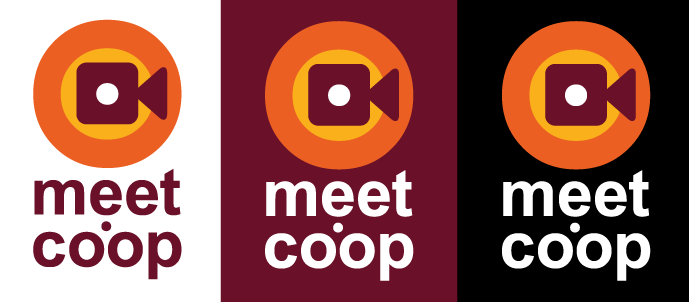
notice that in this version the dot is a circle not a square, because the square jars a bit… and the text is slightly smaller to match the width of the logo mark…
Which makes me think we should do the same with the dot and stick to the same sizing for the landscape version… giving us this:
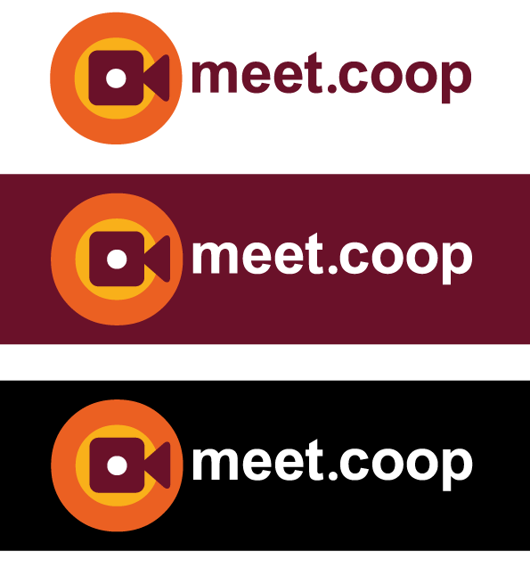
What say you!?
x
---
### Author:  [@osb](https://forum.meet.coop/u/osb)
#### Post date: [26 November 2021 17:59 UTC](https://forum.meet.coop/t/meet-coop-logo-design/48/48 "2021-11-26T17:59:32Z")
[@operational\_members](https://forum.meet.coop/groups/operational_members) PING! What do you think?
(didn’t know I could ping all like that… thanks @3wc - I promise to only do so sparingly 😉 )
---
### Author:  [@mikemh](https://forum.meet.coop/u/mikemh)
#### Post date: [26 November 2021 19:01 UTC](https://forum.meet.coop/t/meet-coop-logo-design/48/49 "2021-11-26T19:01:09Z")
looking good to me now 👍
---
### Author:  [@wouter](https://forum.meet.coop/u/wouter)
#### Post date: [29 November 2021 08:55 UTC](https://forum.meet.coop/t/meet-coop-logo-design/48/50 "2021-11-29T08:55:41Z")
looking good to me, with the dot indeed, in all 6 situations 👌
---
### Author:  [@georgiamoon](https://forum.meet.coop/u/georgiamoon)
#### Post date: [6 December 2021 21:21 UTC](https://forum.meet.coop/t/meet-coop-logo-design/48/51 "2021-12-06T21:21:47Z")
Delayed joining in, but I like the overall direction!
in the vertically stacked logo/wordmark — I don’t love the dot in the middle, it just feels distracting, so I might suggest that in the vertically stacked case that you still keep the “[meet.coop](http://meet.coop)” on one line, and make the font smaller.
---
### Author:  [@wouter](https://forum.meet.coop/u/wouter)
#### Post date: [9 February 2022 17:11 UTC](https://forum.meet.coop/t/meet-coop-logo-design/48/52 "2022-02-09T17:11:45Z")
good to see the logo now on our website! Thanks @osb and @melissamcnab !
[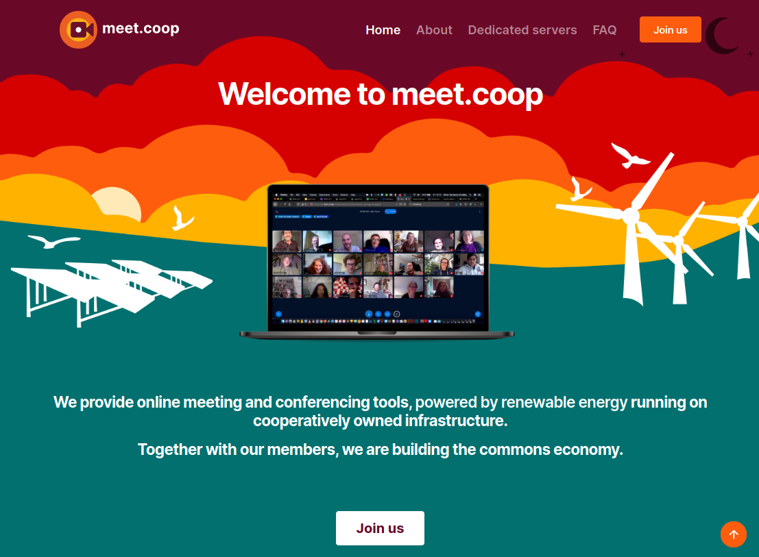](https://meet.coop)
if this is the definitive logo, can you (@osb ?) store the final versions in the product/coms folder structure? Then I/we can maybe apply the new logo to our twitter account, existing presentations about [meet.coop](http://meet.coop), a default presentation slide and what not. And then make a curated wiki page here in the forum where people can access these outreach materials. I am happy to help with that.
---
### Author:  [@osb](https://forum.meet.coop/u/osb)
#### Post date: [9 February 2022 20:34 UTC](https://forum.meet.coop/t/meet-coop-logo-design/48/53 "2022-02-09T20:34:37Z")
Yeah 🙂 nice work swapping it out for the sharper svg version @melissamcnab
We should probably do at least 2 versions, to sit on different light / dark backgrounds, and in different formats… I’m happy to do that unless you’d like to Mel?
---
### Author:  [@melissamcnab](https://forum.meet.coop/u/melissamcnab)
#### Post date: [10 February 2022 11:30 UTC](https://forum.meet.coop/t/meet-coop-logo-design/48/54 "2022-02-10T11:30:40Z")
Thanks @wouter and @osb - everywhere that has [meet.coop](http://meet.coop) is now also lowercase, logo is in the footer - and I’ve done some theme overrides to get the font to stop appearing bold.
I’m happy to sort the logo out today @osb - just with me changing the font out to Inter and moving the letters around since you sent me the file 🙂
---
### Author:  [@JCloser](https://forum.meet.coop/u/JCloser)
#### Post date: [12 November 2023 10:24 UTC](https://forum.meet.coop/t/meet-coop-logo-design/48/56 "2023-11-12T10:24:56Z")
> [@melissamcnab](#):
>
> Hi everyone,
>
> I’m Mel. I’m currently working on the logo design and am hoping for everyone’s input.
>
> Wouter has kindly added his input here: [meet.coop - The Online Meeting Cooperative](https://wiki.meet.coop/wiki/Visual_Design_Inputs)
> I’m just looking for something similar to what he has wrote. What you think of when you think of the word ‘meet’ and any colour schemes you think would work.
>
> If adding to the wiki isn’t possible, feel free to post underneath here. I’d like to try and keep it all in one place if possible though.
>
> Thanks!
>
> Mel
When I think of the word ‘meet,’ I envision a friendly and inclusive atmosphere, so maybe warm and inviting colors like blue and yellow could work well for the logo. But ultimately, it depends on the vibe you want to convey. Feel free to experiment with different color schemes and see what resonates with your target audience.
[Previous page](https://forum.meet.coop/t/meet-coop-logo-design/48.md?page=2)