Default presentation in our rooms

thanks @Yurko for restoring both the custom presentations from the users and meetcoop’s default presentation!

What we could do is to substitute this one

for the black one, as is, or maybe with the new meet.coop logo on it, and a few white pages (that add little kb but can come in handy when collectives want to play.)

Here’s my proposal, that can be improved, but maybe is already much better than current. Opinions?
default-presentation_2022.pdf (editable ODP file is in the same folder)

try it out in the Meet.coop Main Meeting Room

Personally I like it. It gives a unique look to meet.coop’s rooms.

Not a blocker but i wanted to point out that there are a few more features in 2.3. (ie: Raise Hand (bottom right), connection status (top right)) and even more in 2.4 when we move to it.

Do we want to add it to the board, and doe we even have the resource to update it moving forward

1 Like

I did write the Amsterdam designer who did this for us last year, as a favour. But she hasn’t responded.

Maybe we want to use it anyways, until we update it? Current old default slide kinda sucks?

Why don’t we start with the new one and then can update it when we hear back?

Do we have the files somewhere or just the output image?

1 Like

start with the new one and then can update it

+1

atm - on .ca when I try to change my Room’s default presentation I get the error " There was an error updating the room presentation " - @dvdjaco @elon @Yurko can one of you take a look and see if you can fix this? Thanks!

I found the issue and this should be fixed now.

thanks @elon for fixing that error on .ca.

Karen, the designer from Amsterdam told me that she’ll dedicate some time next week to update the slide, i.e. incorporate the hands-up icon.

It has come to mind that our logo isn’t in the BBB screen. AFAIK we have it configured for GreenLight but not for BBB - not sure whether that’s an option. If possible I wouldn’t put it on that default slide. But it wouldn’t hurt to have a tiny meet.coop logo in the BBB screen real estate? We’ll need every help to spread the name & increase membership?

checking the BBB config / customisation docu:

Show a custom logo on the clientAnchor link for: show a custom logo on the client

Ensure that the parameter displayBrandingArea is set to true in bbb-html5’s configuration, restart BigBlueButton server with sudo bbb-conf --restart and pass logo=<image-url> in Custom parameters when creating the meeting.
I’m not sure exactly where the logo would show up and and how it’ll look. Maybe good to add to the dev server config to see?

I can confirm that’s fixed - thanks Elon! :slight_smile:

Great to see this working. Following the discussion around this I took a look because I wasn’t aware that it was even possible to set up a default presentation for a room. In the UI that I saw, on the DE server, it just said “Add a presentation”. I wondering whether that might be edited to red: “Add a default presentation” - which for me would make a lot more sense. After all, I can add a presentation once I’m in the room.

+1 that would be a useful change…

in BBB the term “default presentation” is already taken: it is the site-wide default presentation. One that we are discussing in this thread. You refer to upload a custom presentation for a specific room, something that the room owner (i.e. the user members) can do. Then, as you say, once inside an active room session, the person who acts as presenter can upload additional presentations.

I had asked Karen, the designer from Amsterdam who had made this welcome screen for us, to include these two elements. And yesterday finally she has been able to work on it. Voluntarily.
Meetupstartscherm_engels_02

I observe that the hand-up icon is in the wrong place, should be bottom right to be really intuitive. Anything else? Maybe some extra black space on the outer limits would be really helpful. When you upload this into the whiteboard it’s not looking perfect right now.

She made this in InDesign so unfortunately she cannot deliver a vector format like SVG.

It’s too messy. If this slide is meant to assist people’s understanding of BBB controls I don’t think the hand drawn style is helping. The idea, to have a slide like this, which helps people navigate is a good idea - but think road signs… they use simple fonts and are as clean and clear as possible for a reason. Also, it would be good to use the meet.coop logo, or at least the same font as we use - and the same colours… and maybe even some elements of the ‘cloud’ design so this matches our brand.

1 Like

I’m with Olly on this. The illustration isn’t aligned with the meet.coop branding. Rather than re-present the icons on the slide it might be more useful to use arrows to point to the real ones?

Good points, although somewhat late :wink: I’m a little bit hesitant to ask her to do much work for free, so either we assign a compensation to this or we are very pragmatical about what changes we can ask for.

  • remember that I asked her to make this based on the Cyber4Edu BBB welcome screen that is along these lines, last year for the CitiesForChange forum in Amsterdam, and she made an additional one for us as a favour. Now is just an update.
  • my (limited) design feeling is that adding the logo would make it more messy than necessary (I’d explore where BBB positions the logo if you configure it to use one)
  • we can ask her to use the colours and font of the new meet.coop web design, that would make it much better indeed. Which is that font? (Colours can be easily inferred from the site, but the font is embedded in the logo)
  • re. Graham’s idea of arrows, I’m afraid that it doesn’t necessarily line out correctly, the arrows and the BBB buttons, depending on how one resizes their screen? That’s why Cyber4Edu did it like this.

@osb If you let me know the logo font, I will ask Karen to use our new colours, font and relocate hand-up icon and add some distance between the icons and the borders.

Karen will change the colours into our new corporate id. Only she asks about the font for “meet.coop”. I’m not sure. @osb could you let me know?

arial bold - but with a non arial bold dot (so that it comes up round not square)
she shouldn’t really be recreating the logo - please send her the final versions of the logo from the cloud: https://cloud.meet.coop/apps/files/?dir=/meet.coop/Product%20circle/logo&fileid=78591

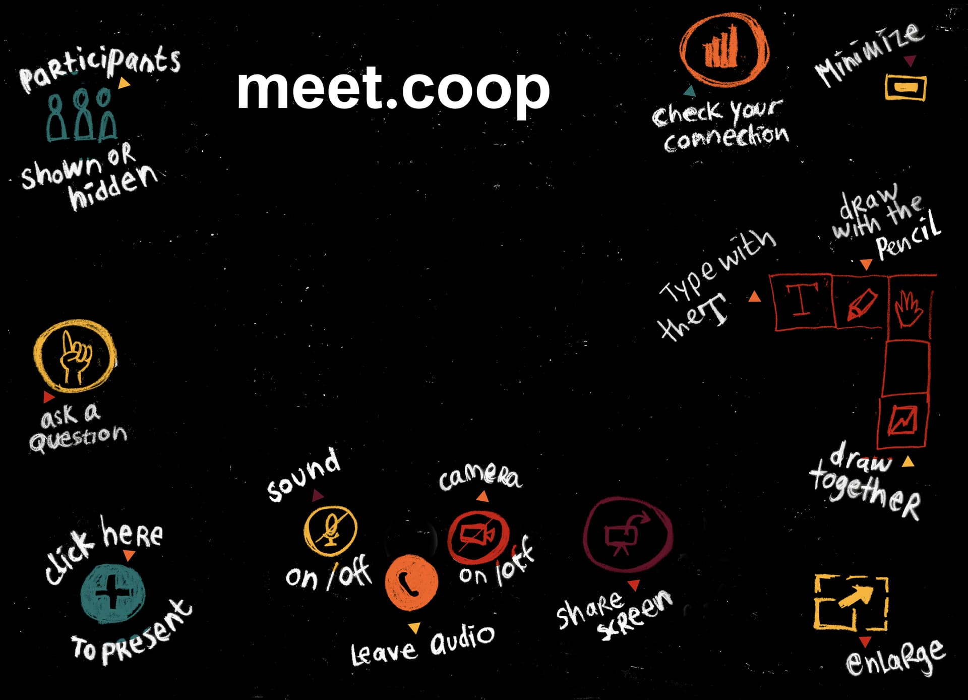
Finally, here’s Karen’s adjusted slide:
meet.coop_default_whiteboard_screen_15-06-22
I have resized it to 233 kb, here’s the link.

Shall we accept it like this and ask tech.circle to substitute this as the default site wide presentation for the rooms (when they can do a next config change)?