Thanks so much @melissamcnab to pick this up again.
Adding to what Oli has said before, here’s my view:
-
I would prefer an icon that can be combined with the name “meet.coop”, but not just a wordmark
-
I am not a fan of the word “dot” in our name. Personally I write “meet.coop” but usually say “meetco-op” when speaking. In that line, I don’t like the “dot” like we have that in our twitter account.
-
but I concur with Oli that " I quite liked the idea that we use a round circle as a ‘dot’ throughout the web design - even as the main Call To Action button/s."
-
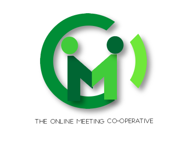
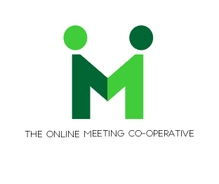
while I liked the abstract ideas of people meeting, like we initially said last year for the design process (like Ubuntu), I have doubts that people easily recognise what this logo represents more than two people doing something together:
 or
or
-
I am with Oli in transmitting that we’re about “video conferencing”, and a video cam or online meeting screen would make much sense to me
-
what if
would resemble more clearly like a video cam? -
about form factor and sizes: it would be useful to have various versions / sizes:
-
- just the icon - for a favicon, really small
-
- the icon with the name “meet.coop” to it (maybe a square format and a landscape one, depending where you locate the name?)
-
- the icon with the full name “The Online Meeting Co-operative” for bigger sizes.