0 voters
Hey everyone, new poll from everyone’s suggestions underneath the last one. (I’ve used the icon that had the most votes last time.)
0 voters
Hey everyone, new poll from everyone’s suggestions underneath the last one. (I’ve used the icon that had the most votes last time.)
In the case of the version with no enclosing circle, the text ‘The online meeting cooperative’ should be split over two lines, so that it’s about the same width as the graphic element?
I’m finding it hard to vote on these…
As a designer / marketing / branding person I like to fully understand the ‘mission’ / ‘purpose’ and ‘tone of voice’ and ‘perception’ the brand is aiming to communicate before heading off into visual design… so (while I like some aspects of this work  ) I think it’s too early to be deciding on a final logo.
I would propose we agree our ‘mission’ or ‘purpose’ first… then do some work on the general tone / style of our desired brand… then, once that is agreed, move on to design.
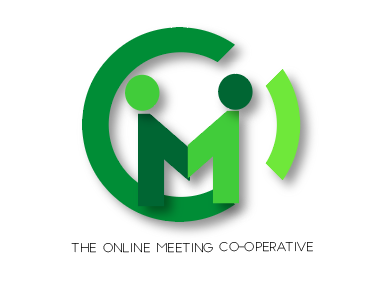
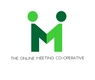
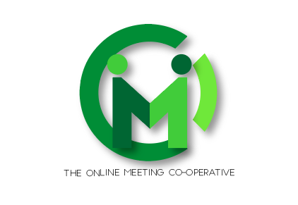
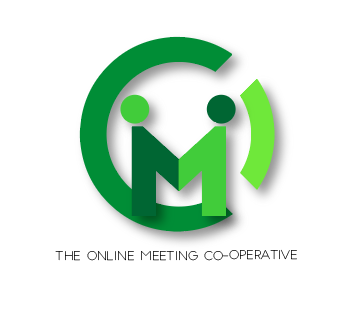
To me the purpose of meet.coop is more than just online meetings… it’s about pooling resources, collaborating, and a dedication to using open source tools which WE own… and the logos above don’t really communicate any of that…
To me, (again, these just my thoughts - and I’m happy to go with the flow if others disagree) we should aim high, and set our sights on being a leading example of cooperation between MANY groups and people… so any branding should reflect the multi-lateral nature of that (i.e. more than 2 people) …
I also think the fact that we’re a co-op should be held quite highly, so I would like to see that reflected in the branding … not just in the strapline (which often gets dropped - and would be unreadable in the current proposals when the logo was used small i.e. 16 x 16px) … I’m not saying we should use the existing coop logo… but maybe we should consider that ? or some other way of depicting cooperation between many people and groups…
These are just my initial thoughts… I’d be happy to contribute to a Branding / Marketing / Design circle too if that’s an idea?
Since we’re taking our time to get the design of the actual co-op right, and that feels like time well invested, I think it makes sense for the branding to follow a similar plan… there doesn’t seem to be an immediate deadline for this so maybe it’s OK to go back to the drawing board a bit and ensure we have captured everything we hope the brand will incorporate, then to move on to design?
I hope that makes sense!?
Please don’t take this as criticism of your design’s @melissamcnab - it’s great you have kicked off this work 
best
oli
I think this will begin to become clearer as we start to have conversations with early-adopters like MayFirst, maybe social.coop, FOEI. We’ll begin to note what it is that we have to articulate in these dialogues, in response to their queries.
In the short term we need one-pagers for front office (membership, service levels, etc - which is coming along nicely), back office (the distinct orientations of the circles, operational decision making,etc - this is up next) and assembly/voting/strategic steering (which we have yet to tackle). When we have these three, especially the last, we’ll be much closer to specifying mission/purpose. Early-adopters will want to know these three stories, if they’re to commit to operational involvement in meet.coop (which we would like) or significant user-dependence on meet.coop, through the exciting ride of the first year or two. We want folks signing up for the historic project, not just for the greenlight room?
MEET and COOP are both 4 letters and it spells out our domain, may be a stacked wordmark that both conveys Meeting and Coop? This could be in addition to a “simple” (as in minimal elements) logo icon, and we can select when to use which as appropriate. For example, the favicon cannot be a wordmark, it would look terrible scaled down.
With a wordmark, the icon can be simpler with few elements. I like the idea of two people meeting making an M, that would fit into “square and circular frames” well (think how LinkedIn and Twitter icons appear).
In general, I don’t like drop shadows in the base icon, it’s something to be added on top. For example, some Android UI add shadows to app icons. e.g. having this in a circle which itself has a shadow makes it super weird.
I am not a fan of the colours. Maybe @melissamcnab can propose a few colour palettes for us to vote on, then we can move on from there?
I think we should also talk about typefaces as we may start working on marketing materials / website soon one service levels are agreed upon. This may also influence how the logo M is stylized, the weight on the lines, etc.
I am imagining a package like this that web developers and marketing folks can draw on when creating public content. Thanks for all the work @melissamcnab it’s hard to come up with something that makes everyone happy, especially when everyone is allowed to have an opinion 
Is it an option not to have a fixed logo but let it continue to evolve as we go?
That itself might be a great symbolism of diversity, inclusion, and most importantly, being participatory (and in the meaningful, not some cheap capitalist PR b*******, sense) 
Hi, checking in from Autonomic – my colleague @decentral1se has been shopping meet.coop to us after his load of work on the infra, and we’re excited to use it 
I’m wondering if it’s worth adopting one of these logos while the longer-running conversation over in Brand survey - what is Meet.coop to you continues? The front-runner so far is this one:
but I think any of @melissamcnab’s designs seem like a huge and quick improvement over the current one:

especially at smaller sizes:
![]()
![]()
What do people reckon?
Yeah 100%.
Also, I don’t know if having logo design out in open like this is really productive for the person doing the design as they length and breadth of criticism that can be received is hard to take as actionable. Like, especially when full re-designs are proposed from an MS-paint style sketch.
Thanks @melissamcnab for this work.
I don’t think it makes sense to deploy a new logo - and then revise it and deploy new branding and a different logo again a few weeks later… Mel is working on the new branding / designs now so we should be good to go with the whole new look in a few weeks
Sorry, didn’t see a notification for this post for some reason!
In terms of the logo change, I meant here on this forum and on the Greenlight instance; there doesn’t seem to be one on the public meet.coop site? I guess it depends exactly where things are at with the new branding, but it does seem worth doing that minimal stop just in case things get held up at all with the re-brand…
Rebooting this thread - So we can close out the logo work.
Mel posted some designs in the June 3rd All Hands thread - which she shared with Goteo:
To close out the logo work, I think we need to revisit the previous work on the logo - review what we have to date (some / all? of which is above) and discuss and decide (probably in a small group - rather than with everyone) what are we trying to communicate with our logo - and whether any of the existing ideas / designs do what we want / contain elements of what we want… Then, to hone in on one or two designs which satisfy… and perhaps put the final choice to a vote?
Personally I am not a fan of the word ‘dot’ it looks a bit clunky to me - and I quite liked the idea that we use a round circle as a ‘dot’ throughout the web design - even as the main Call To Action button/s.
Maybe it’s worth re-visiting some of the designs above - and showing these in our chosen colours now we have chosen our colour theme… so we can see what they look like?
Personally, and others may have different opinions, I don’t think a logo should try to do too much … the simpler the better… so we shouldn’t try to communicate: “We’re a co-op”, “this is all about video conferencing” AND “we encourage collaboration” all in one design - but to pick a single concept and stick to illustrating that… the most obvious concept we should aim to communicate, imho, is simply “online meetings” - which seems to most ubiquitously be communicated via a video camera type icon… not that we have to follow convention - but it is an internationally recognised icon… which we might want to leverage somehow…
Ideally, if possible our logo should work in a square format (so it can also be used in round spaces - like on FB / profile pics etc) AND in a landscape format - as per the header of the website etc.
@all - please chip in with your own thoughts!?
@melissamcnab - does that give you enough to go on to prepare some final concepts?
I’m happy to have a call to discuss if it would help?
Oli
@melissamcnab - did the above make sense!?
Do you think you will have some time to work on the logo this week / month?
Now that there are less contributors to meet.coop and more subscribers our compensation rate has increased significantly so you should consider this paid work!
It does thanks @osb - thanks for the feedback
Just touching on this section
To close out the logo work, I think we need to revisit the previous work on the logo - review what we have to date (some / all? of which is above) and discuss and decide (probably in a small group - rather than with everyone) what are we trying to communicate with our logo - and whether any of the existing ideas / designs do what we want / contain elements of what we want… Then, to hone in on one or two designs which satisfy… and perhaps put the final choice to a vote?
I think it would be great to get everyone elses opinion too - I think some sort of sociocratical decision making for it would be good as I’ve had a lot of mixed opinions on ‘what is a good logo’ - for example, I know some who would prefer a text logo, over illustrative and vice versa. Getting some sort of ‘range of tolerance’ would be great.
I think it’s important to highlight how long we’ve been deliberating over this and each direction I’ve taken comes from who I’ve spoken to most about it within a particular month. I’ve about an hour spare at the end of a number of work days over the next month that I’d happily use for finishing this off on the premise we can agree on a look and feel before I start proposing finals.
Is a session like this something we could try and put together? @operational_members is this something you would likely want to attend?
@melissamcnab just to say, you have the patience of a saint 
Thanks so much @melissamcnab to pick this up again.
Adding to what Oli has said before, here’s my view:
I would prefer an icon that can be combined with the name “meet.coop”, but not just a wordmark
I am not a fan of the word “dot” in our name. Personally I write “meet.coop” but usually say “meetco-op” when speaking. In that line, I don’t like the “dot” like we have that in our twitter account.
but I concur with Oli that " I quite liked the idea that we use a round circle as a ‘dot’ throughout the web design - even as the main Call To Action button/s."
while I liked the abstract ideas of people meeting, like we initially said last year for the design process (like Ubuntu), I have doubts that people easily recognise what this logo represents more than two people doing something together:
or
I am with Oli in transmitting that we’re about “video conferencing”, and a video cam or online meeting screen would make much sense to me
what if would resemble more clearly like a video cam?
about form factor and sizes: it would be useful to have various versions / sizes:
I really like the colourful, bold, block-graphics, landscape-ish aesthetic of
Combining this as above with the tiny screenshot/laptop mockup is a klunky mix of aesthetics? Even tho I like the screenshot itself, it’s way too tiny to work as a piece of information in that larger composite? If (a variant of?) the screenshot is used, drop the bold block graphics. And vice versa? They just don’t sit together?
Signalling online video, like Wouter says, is important I think. But with a symbol which will work at favicon scale, I suspect, rather than a photographic image, as above. Symbol for video meeting is a puzzle. A gathering space, with humans? Or a camera? Don’t want to look like Instagram!!
How about something icon-based, which includes these icon and text elements, in some combination:
We certainly need a text-inclusive version of the ID, not just a symbol which works at favicon scale. I definitely dislike the uppercase text in the coloured-landscape version. I definitely favour lowercase over Sentence case, Initial caps or (in this kind of context) Camel case. And like @wouter I really dislike any emphasis on DOT. Like Wouter, I speak “meetcoop” rather than “meetdotcoop”. Emphasiising that text element is really counterproductive. Edward Tufte says, in design, “One plus one equals three or more”. The fewer visual and text elements the better. In the sample above, the ‘dot’ seems to me to have the right degree of emphasis - almost invisible yet pivotal as a visual element.
The aesthetic of that icons.plus.txt version is a bit tech-machine. But I don’t think it’s possible to combine a warm ideal landscape AND a human photographic image AND video-signifying icons AND txt. Something has to be given the push? In that case, I’m willing to go with the icons. Maybe, in warm earth ochres?
Enough! I really feel for @melissamcnab
each direction I’ve taken comes from who I’ve spoken to most about it within a particular month
We should organise a process that enables Mel to close this out. I will attend.
Feedback on the new website style @melissamcnab It’s nice to see it implemented 
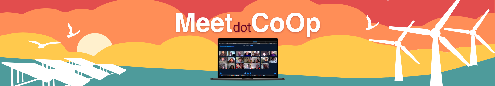
I do like the underlying field of coloured clouds, green landscape, relaxed wavy contours. https://www.meet.coop/ Zooming in on this, so that it becomes abstract shapes with wavy relaxed forms, is nice, as at About – The Online Meeting Cooperative
When the wavy aesthetic is abandoned, and replaced by massive rectangular blocks - as at Dedicated servers – The Online Meeting Cooperative - this looks ugly, and basically destroys the aesthetic.
A massive block of the oxblood colour on that page looks unpleasant too imho, against the warm ochre. Maybe that darkest tone should only be used for local highlights or text, not big blocks? Maybe the green and ochre colours from the swatch are the only ones that will bear being used in massive blocks? Text over green would be white-on-colour, text over ochre would be dark-on-colour?
With a colour swatch ranging fropm oxblood thro reds and ochre to green . . which is the ‘base coliour’ or key colour? - a colour that should appear on all pages as a basic ID? My instinct is the ochre, but maybe that’s just my colour preference.
Specific features in the pictorial schema, like the solar farm, can be problematic. On the home page https://www.meet.coop/ the solar farm is white-on-colour, and so is the overlying text. Which makes the text unreadable.
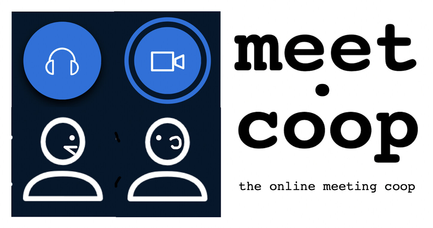
i made a few draft logos… not sure about the typeface but I think the logo element itself is OK - any comments / feedback?
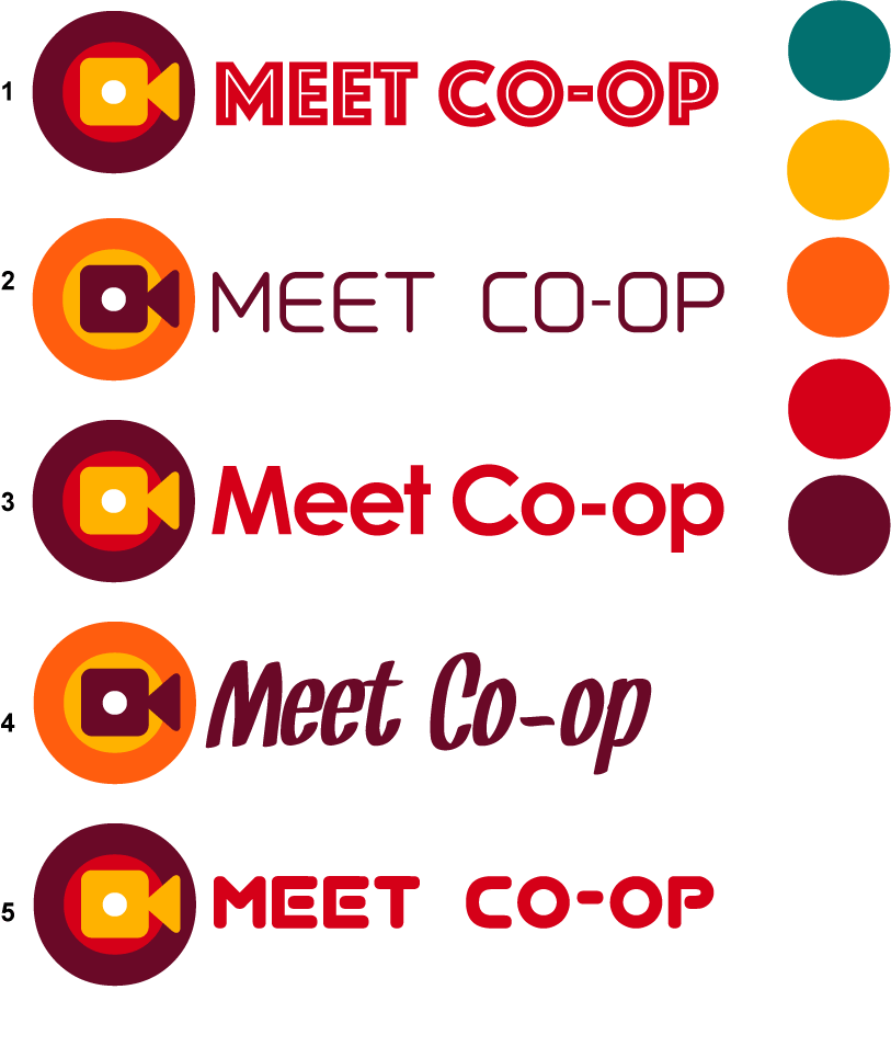
I think the logo element is nice 
Colourwise, I feel the dark schemes, brown/red, don’t work well (not legible, the inner colour more or less disappears) and the orange/yellow scheme does work well (options 2 & 4).
Fontwise, I kinda like the script font (option 4). I’m not a fan of Futura-style alphabets (option 3). Although . . I do like the extra-bold Gill Sans (?) style alphabet with the white inline (option 1). The rounded-corner fonts (options 2 and 5) are yuk, I feel.
A different informal script font might be better - the letter-spacing in this one, between initial caps and lower case, isn’t the best. But I like the informality.
How does the orange/yellow combo work with the other exiisting elements of the house style? Eg the web homepage. What colours does the logo stand against as background, in that setting?
Currently, we already have white lettering over white graphics (the solar panel farm) in the homepage banner, which needs to be tweaked.
interesting draft logo proposals, @osb!
I’m generally agreeing with @mikemh’s feedback. An orange coloured outside circle with a darker cam icon inside.
I’d say not to make difference between capital and small caps, so either all small or all capital. Maybe none of the fonts really please me too much.
About the background, I’m thinking we’ll want to locate it top left, right? So on the main web we’d have the dark brown-red as background. In parallel we’ll also want to see to how it looks in the forum, and Greenlight and make possible header / BG colour adjustments there.
@melissamcnab are these inputs useful for you? Let us know how you want to tackle this.