I really like the colourful, bold, block-graphics, landscape-ish aesthetic of
I’m unsure whether the iconography fully works. Maybe the windmills do, but I feel the solar panels don’t. Rising suns and colourful open skies and wide landscapes is good? Even birds, I think. And a hint of Rainbow Flag. Earth tones is good - ochres and such. No hot pinks, hooray!
Combining this as above with the tiny screenshot/laptop mockup is a klunky mix of aesthetics? Even tho I like the screenshot itself, it’s way too tiny to work as a piece of information in that larger composite? If (a variant of?) the screenshot is used, drop the bold block graphics. And vice versa? They just don’t sit together?
Signalling online video, like Wouter says, is important I think. But with a symbol which will work at favicon scale, I suspect, rather than a photographic image, as above. Symbol for video meeting is a puzzle. A gathering space, with humans? Or a camera? Don’t want to look like Instagram!!
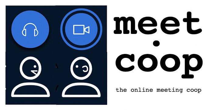
How about something icon-based, which includes these icon and text elements, in some combination:
We certainly need a text-inclusive version of the ID, not just a symbol which works at favicon scale. I definitely dislike the uppercase text in the coloured-landscape version. I definitely favour lowercase over Sentence case, Initial caps or (in this kind of context) Camel case. And like @wouter I really dislike any emphasis on DOT. Like Wouter, I speak “meetcoop” rather than “meetdotcoop”. Emphasiising that text element is really counterproductive. Edward Tufte says, in design, “One plus one equals three or more”. The fewer visual and text elements the better. In the sample above, the ‘dot’ seems to me to have the right degree of emphasis - almost invisible yet pivotal as a visual element.
The aesthetic of that icons.plus.txt version is a bit tech-machine. But I don’t think it’s possible to combine a warm ideal landscape AND a human photographic image AND video-signifying icons AND txt. Something has to be given the push? In that case, I’m willing to go with the icons. Maybe, in warm earth ochres?
Enough! I really feel for @melissamcnab
each direction I’ve taken comes from who I’ve spoken to most about it within a particular month
We should organise a process that enables Mel to close this out. I will attend.

