Meet.coop Logo Design

I really like the colourful, bold, block-graphics, landscape-ish aesthetic of


I’m unsure whether the iconography fully works. Maybe the windmills do, but I feel the solar panels don’t. Rising suns and colourful open skies and wide landscapes is good? Even birds, I think. And a hint of Rainbow Flag. Earth tones is good - ochres and such. No hot pinks, hooray!

Combining this as above with the tiny screenshot/laptop mockup is a klunky mix of aesthetics? Even tho I like the screenshot itself, it’s way too tiny to work as a piece of information in that larger composite? If (a variant of?) the screenshot is used, drop the bold block graphics. And vice versa? They just don’t sit together?

Signalling online video, like Wouter says, is important I think. But with a symbol which will work at favicon scale, I suspect, rather than a photographic image, as above. Symbol for video meeting is a puzzle. A gathering space, with humans? Or a camera? Don’t want to look like Instagram!!

How about something icon-based, which includes these icon and text elements, in some combination:

We certainly need a text-inclusive version of the ID, not just a symbol which works at favicon scale. I definitely dislike the uppercase text in the coloured-landscape version. I definitely favour lowercase over Sentence case, Initial caps or (in this kind of context) Camel case. And like @wouter I really dislike any emphasis on DOT. Like Wouter, I speak “meetcoop” rather than “meetdotcoop”. Emphasiising that text element is really counterproductive. Edward Tufte says, in design, “One plus one equals three or more”. The fewer visual and text elements the better. In the sample above, the ‘dot’ seems to me to have the right degree of emphasis - almost invisible yet pivotal as a visual element.

The aesthetic of that icons.plus.txt version is a bit tech-machine. But I don’t think it’s possible to combine a warm ideal landscape AND a human photographic image AND video-signifying icons AND txt. Something has to be given the push? In that case, I’m willing to go with the icons. Maybe, in warm earth ochres?

Enough! I really feel for @melissamcnab

each direction I’ve taken comes from who I’ve spoken to most about it within a particular month

We should organise a process that enables Mel to close this out. I will attend.

1 Like

Feedback on the new website style @melissamcnab It’s nice to see it implemented :pray:

I do like the underlying field of coloured clouds, green landscape, relaxed wavy contours. https://www.meet.coop/ Zooming in on this, so that it becomes abstract shapes with wavy relaxed forms, is nice, as at About – The Online Meeting Cooperative

When the wavy aesthetic is abandoned, and replaced by massive rectangular blocks - as at Dedicated servers – The Online Meeting Cooperative - this looks ugly, and basically destroys the aesthetic.

A massive block of the oxblood colour on that page looks unpleasant too imho, against the warm ochre. Maybe that darkest tone should only be used for local highlights or text, not big blocks? Maybe the green and ochre colours from the swatch are the only ones that will bear being used in massive blocks? Text over green would be white-on-colour, text over ochre would be dark-on-colour?

With a colour swatch ranging fropm oxblood thro reds and ochre to green . . which is the ‘base coliour’ or key colour? - a colour that should appear on all pages as a basic ID? My instinct is the ochre, but maybe that’s just my colour preference.

Specific features in the pictorial schema, like the solar farm, can be problematic. On the home page https://www.meet.coop/ the solar farm is white-on-colour, and so is the overlying text. Which makes the text unreadable.

i made a few draft logos… not sure about the typeface but I think the logo element itself is OK - any comments / feedback?
meet-coop-logo-4

I think the logo element is nice :green_heart:

Colourwise, I feel the dark schemes, brown/red, don’t work well (not legible, the inner colour more or less disappears) and the orange/yellow scheme does work well (options 2 & 4).

Fontwise, I kinda like the script font (option 4). I’m not a fan of Futura-style alphabets (option 3). Although . . I do like the extra-bold Gill Sans (?) style alphabet with the white inline (option 1). The rounded-corner fonts (options 2 and 5) are yuk, I feel.

A different informal script font might be better - the letter-spacing in this one, between initial caps and lower case, isn’t the best. But I like the informality.

How does the orange/yellow combo work with the other exiisting elements of the house style? Eg the web homepage. What colours does the logo stand against as background, in that setting?

Currently, we already have white lettering over white graphics (the solar panel farm) in the homepage banner, which needs to be tweaked.

interesting draft logo proposals, @osb!

I’m generally agreeing with @mikemh’s feedback. An orange coloured outside circle with a darker cam icon inside.

I’d say not to make difference between capital and small caps, so either all small or all capital. Maybe none of the fonts really please me too much.

About the background, I’m thinking we’ll want to locate it top left, right? So on the main web we’d have the dark brown-red as background. In parallel we’ll also want to see to how it looks in the forum, and Greenlight and make possible header / BG colour adjustments there.

Screenshot from 2021-11-17 11-18-12

Screenshot from 2021-11-17 11-25-00

@melissamcnab are these inputs useful for you? Let us know how you want to tackle this.

@wouter 's screenshots above are helpful. The landscape-format implementation in the forum header is a good model to follow: icon top-left, plus text The online meeting cooperative

Q: As an element within a landscape-format logo, how does the main text ‘meet.coop’ - as in examples 1-5 above - combine with the strapline The online meeting cooperative, which I assume (?) we will continue to use? Above I offered a three-part combination of graphic PLUS text x2 (where text x2 = main text PLUS strapline). Is this an acceptable format?

Q: Should the basic set of icons include both a landscape and a portrait implementation of iconPLUStext? Or just landscape as above? The portrait format would have two elements (graphic, text x2) stacked, while the landscape format would have them side-by-side.

Agreeing with Wouter as regards the typefaces. I’m OK with a conventional sans serif font as in the screenshots of the Forum icon or in the Greenlight page header (possibly in bold, as in the Forum header screenshot). We should only (?) depart from these norms if there’s a font that has some distinctive character that we REALLY love. I don’t feel that any of the fonts in examples 1-5 above are really loveable. (Example #1 may be closest but too bold, overpowering the graphic element.)

Hi All,
Thanks for the feedback :slight_smile:
I’m not sure we need to stick to the full name “The Online Meeting Cooperative” for the logo…
To me the full name is more like the company name, which might be used in ‘official’ situations / communications, but I don’t think it needs to be part of the logo.

Here’s some examples of the two:

meet-coop-logo-5

and in situ on the home page, with the letters reversed into white:

hp-with-logo

hp-with-logo2

If we drop the capital M in meet.coop we should probably also drop it in the explanatory text below on the home page - and elsewhere throughout the website and all other comms.

Landscape and portrait orientations would be good … but the dot in meet.coop unbalances it slightly:

meet-coop-logos-portrait

Any thoughts?

I’m still not convinced we should stick to Arial as the font - anything else would be preferable imho!

Here’s some examples using the ‘phosphate’ font:

meet-coop-logo-phosphate

and in situ on the home page:

meet-coop-phos-hp

Agreed

If we drop the capital M in meet.coop we should probably also drop it in the explanatory text below on the home page - and elsewhere throughout the website and all other comms.

Agreed. I routinely do this already, and @wouter does too I think. I prefer all-lower case rather than intial caps.

Landscape and portrait orientations would be good … but the dot in meet.coop unbalances it slightly

Using a fixed-width (monospaced) typeface, and treating ‘dot’ as a distinct (tiny) element resolves some of this? A square block like this one below can be used in both landscape and portrait versions? Not trying to sneak ‘the online meeting coop’ back in, it’s just part of the jpg I’m using!

I’m still not convinced we should stick to Arial as the font - anything else would be preferable imho! . . [eg] the ‘phosphate’ font

Agreed. I’m OK with Phosphate as a font. But it works best in upper case, and here I’m advocating lower case. Also, it’s not a fixed-width typeface.

Finally: I wonder what the graphic element of the logo would look like, if the camera were entirely within the inner circle, rather than overlapping the two? Leads to a larger inner circle, and more centre-colour. Not a problem, I feel.

good progress here. I’d favor also the “meet.coop” with the logo, in landscape it works very well. No idea yet how to make it perfect in portrait. BTW i’d prefer “coop” and not “co-op”. I’m aware that British English has a preference for the “-” in between, but it seems that the rest of the world is happy without the “-”, and not to mention that our Top Level Domain name ends in “.coop” really :slight_smile:

2 Likes

imho this one rocks!
Screenshot from 2021-11-25 12-30-52

3 Likes

Maybe just one tweak? Reduce the size of the font a tad. Rather than the x-height aligning with the camera lens, maybe align the ascender-height instead. Makes the text a little less dominant, the logo a little more prominent?

This linear rather than block format for the text does make a straightforward portrait-format version unlikely? But we can live with landscape-only? I’m ready to go with this @osb @melissamcnab

good feedback - thanks
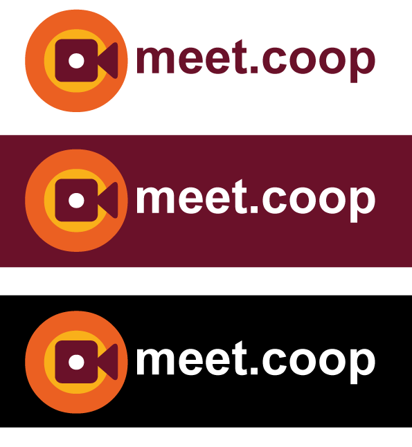
new versions with slightly smaller font, showing options for coloured & black backgrounds
meet-coop-logo-6

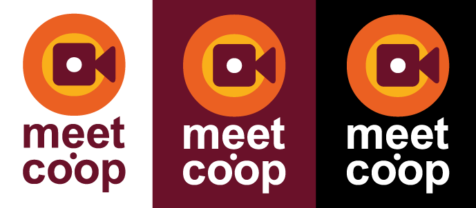
and an experiment to see if I can make it work in portrait too, which I think would be useful

meet-coop-logo-6-port

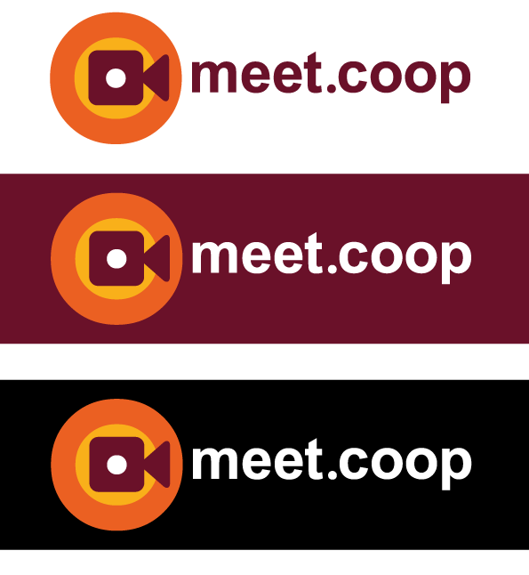
notice that in this version the dot is a circle not a square, because the square jars a bit… and the text is slightly smaller to match the width of the logo mark…

Which makes me think we should do the same with the dot and stick to the same sizing for the landscape version… giving us this:

meet-coop-logo-6b

What say you!?

x

@operational_members PING! What do you think?
(didn’t know I could ping all like that… thanks @3wc - I promise to only do so sparingly :wink: )

1 Like

looking good to me now :+1:

1 Like

looking good to me, with the dot indeed, in all 6 situations :ok_hand:

1 Like

Delayed joining in, but I like the overall direction!

in the vertically stacked logo/wordmark — I don’t love the dot in the middle, it just feels distracting, so I might suggest that in the vertically stacked case that you still keep the “meet.coop” on one line, and make the font smaller.

1 Like

good to see the logo now on our website! Thanks @osb and @melissamcnab !
meet.coop_renewed_homepagefeb_2022

if this is the definitive logo, can you (@osb ?) store the final versions in the product/coms folder structure? Then I/we can maybe apply the new logo to our twitter account, existing presentations about meet.coop, a default presentation slide and what not. And then make a curated wiki page here in the forum where people can access these outreach materials. I am happy to help with that.

Yeah :slight_smile: nice work swapping it out for the sharper svg version @melissamcnab
We should probably do at least 2 versions, to sit on different light / dark backgrounds, and in different formats… I’m happy to do that unless you’d like to Mel?

1 Like

Thanks @wouter and @osb - everywhere that has meet.coop is now also lowercase, logo is in the footer - and I’ve done some theme overrides to get the font to stop appearing bold.

I’m happy to sort the logo out today @osb - just with me changing the font out to Inter and moving the letters around since you sent me the file :slight_smile:

When I think of the word ‘meet,’ I envision a friendly and inclusive atmosphere, so maybe warm and inviting colors like blue and yellow could work well for the logo. But ultimately, it depends on the vibe you want to convey. Feel free to experiment with different color schemes and see what resonates with your target audience.