Today @3wc and myself have hand a handson working session to improve the forum. The full notes are in here.
In sum what we have done today:
reorganise top level categories in the order they are presented on the frontpage
thinking from the PoV of new and less regular users, we moved and renamed this as the first category. Support & Feedback. here is where we expect the most pressing issues o be handled, like queries about how things work, what doesn’t work or could be improved, user documentation, user reports (which we should our members ask to make and post here, but some kind pushing might be useful)
the onboarding of new users: new users are now subscribed automatically to a new announcement category called “Announcements & Service Updates”. Here only ops members can post to distribute important news, meetcoop events and service updates. All current and future members are now subscribed to this and thus will receive email notification (unless they switch that off). So we should be responsible and treat this category with the utmost care.
we have cleaned up some stuff
we have had a first look at our usage stats and consider to make some custom metrics that should help guide our work when bringing this community space to fruition.
In short: we have a wonderful space and 174 signed up people, but are not making too much use of it right now. While we started in 2020 spring/summer with an active community focus, the last 15 months have been less engaging, i.e. we have focused primarily on Ops members and have somewhat abandoned our forum and our community. We expect #commons.hour to bring new live to our community, and help put it really in the centre. There’s lots of things we can still do to improve the forum. We brainstormed a short list of topics that we’d like to work on:
define some goals, and metrics for success
regular engagement
review specific activities:
voting
signup for all hands meetings
use of banners & pinned messages: do with care; if too much, it can be a nuisance
asking for feedback / discussing towards a decision inside threads
gamification, trust levels, reputation → spam? We didn’t have much of that problem so far. We could devise a rule that automatically adds people to a group of “active users” enabling them to participate in certain types of voting (part of larger Governance discussion, take to commons.hour)
Designate which tools to use in which situations (more clearly):
Thanks so much @wouter, great working with you, and I think we made a decent start.
Main changes I can remember here are that we un-pinned the commons.hour topic, and a default “welcome to Discourse” thread that nobody had ever replied to
To highlight this to all @operational_members (sorry for the mass-ping ): any posts or replies you make in #announcements-updates will be sent by email to everyone on the forum, unless they specifically opt out. Please use this… sparingly!
Feels like we’re deepening our investment in Discourse, as our Forum platform? Can you recommend a good critical review of Discourse and its capabilities, not too long but identifying the important things?
Originally I felt Discourse was popular bcos it offers admins so many config options. I begin to see now how it can be tooled to help participants - but am still not sure how far it works for contributors rather than admins. Is it just me that has this nagging scepticism?
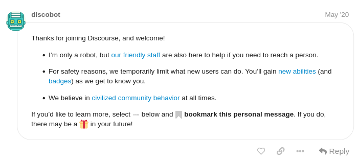
Welcome to %{site_name} — thanks for contributing!
%{new_user_tips}
Please be kind to your fellow community members, see our community guidelines for full details. This panel will only appear for your first %{education_posts_text}.
As you participate here, we’ll get to know you, and temporary new user limitations will be lifted. Over time you’ll gain trust levels that include special abilities to help us manage our community together.
Does the title sound interesting if you read it out loud? Is it a good summary?
Who would be interested in this? Why does it matter? What kind of responses do you want?
Does your reply improve the conversation?
Constructive criticism is welcome, but criticize ideas, not people.
in sum, @3wc and myself have made a few improvements today to this forum:
added some links in the header of the forum: a) to meet.coop website, b) CA server, c) DE server
changed some text messages for new forum users; when typing their first post, they’ll now see some hints wrt support & welcome thread to present themselves
we’d wanted to do the same for the welcome email msg for new forum users, but apparently it is not being delivered (stays on our todo list: Calix will check with Chris)
I just adjusted the default Guidelines page that Discourse puts up for any new forum site; the hardcore stuff on “intellectual property” is now softened, and it links to our Disclaimer/Terms of Use now.
we looked into “voting”, observing that “public voting” isn’t really showing the names of the voters, so we still don’t know who’s favouring what to enable more intelligent processes. All new messages in the Decisions category are now being notified to all @operational_members If you have any issue with this, we can make it more fine grained (like narrow it down to a subcategory)
We’d like to have your feedback before making further improvements. Does this make sense, what are we missing, what would you prioritise in terms of forum improvements?
The send new trust level 1 users a welcome message setting is enabled and I’ve checked the mail logs for the last three Discourse accounts created on this forum and one email appears to have been sent to each email address associated with each account without an error, should people receive more than one email when they create an account?
Thanks for checking, @chris . Maybe then there’s some confusion about what’s the Welcome mail: today when I signed up with another email address, I got exactly one mail: the activation email, with this subject line and body:
1 Links in the header is good thanks. Not exactly prominent, but that’s just the Discourse house style, not modifiable?
2/3/4 Seem good.
3 Having polls that are useful would be REALLY useful.
PS I’d never seen the YouTube help video before, that’s linked from the Greenlight page on the server(s). Very neat and informative. We should put this more up front? @osb@melissamcnab is this kind of assistance prominent in the website - I recall that some help videos had got ‘lost’.
PPS meet.coop web homepage (accessed from forum link above) still doesn’t read cleanly viewed on a mobile device, white text overlaid on white background.
Some discourse forums use graphic icons per category. I think that is nice as it helps people identify where to go. For ex https://forum.holo.host/ Is that something we would like to have/do for our community?
Website is looking clean, and working well on clicking Nice on the iPad too (Firefox).
In my laptop browser (Firefox, MacOS) the background graphic in title page is offset, only left-hand half is in view in my browser, windmills are missing. But OK on the iPad.
Are there some BBB help videos to be posted somewhere in the site? Not accessible via FAQ right now.
@osb@wouter@3wc@melissamcnab This is about public UI/UX design in general (eg handbook-type enquiries) but relates to this discussion about our Forum . .
In the thread they’re seeking to engage with the fact that there are “several valid ways to organize documentation for different readers coming for different reasons and from different places” [my emphasis] - something we also need to be able to handle well, here in the forum and also in our website and Handbook.
@melissamcnab and I chatted yesterday about improving UX in our forum and handbook (aka navigation; also aka filtering), and ‘landing’ in meet.coop generally. My own thoughts below, with various question marks in code format. Please do chip in . .@chris@3wc@Hakanto@wouter Three topics:
Threads in the forum are currently being recategorising and tagged. Categories/subcategories map content/structure, tags identify modes of enquiry or frames that a user might want to adopt in filtering content, across categories.
Categories are limited to one level of nesting, fine for forum threads but perhaps not sufficient for the Handbook. There’s a sidebar plugin to display levels of headings within a post, effectively created many levels of nesting. See here for an example Administrative Bulk Operations - Self-Hosting - Discourse Meta. But this is poorer than an overall site view that nests, say three levels deep?@chris can you identify this plugin? And install it for us?
Visual representation of structure is essential? The current text view of categories https://forum.meet.coop/ is poor on ‘geography’ and not great for dyslexic or visually oriented people. So we should should install the [Table of contents plugin], which at least gives a visible spatial-logical dimension to structure. @chris can you install the plugin for us? Thanks.
Visitors to the forum should be offered an overall view of structure on a landing page. Presumably TableofContents? What then is the role of the https://forum.meet.coop/ view, and where does it sit?
Tags currently are these: The meet.coop Forum Organised under six tag groups: Circles (operational areas in the coop), Commons principles (purposes and commitments of the coop), Decisions (outcomes and pending), Members (user, operations, Board, general public), Spaces (platform, media, venues) and Timeframes (right-now, ongoing deliberation, lasting stuff like FAQs). Hopefully, if folks are offered these frames on a forum landing page, it may help them filter across a number of categories, for enquiry-relevant content?
Tagging in our forum is an admin function, not a user-configurable framework. It would be lovely if individual users could tag content. But Discourse doesn’t offer the flexibility of distinct systems of admin- and user-tags. On this basis, a display of **tag clouds** probably is not relevant?
As noted above, a landing page should display both an overall structure map (as visually as possible. Better than ToC would be ideal - still quite textual - but probably not easy) and a number of ‘frames’ for filtering content across categories.
To create a custom landing page, as visually helpful as possible, we should use the website, edited thro Jekyll. Thus the website would become the default way into the forum and the handbook, as well as the coop’s marketing (eg videos), public information (eg vision/mission statements) and guides to membership and accounts. A proper coop landing page?
Icons to highlight categories, or perhaps graphics on categories’ header pages? Yes in principle. @melissamcnab will send links to icon libraries. Sorry mel, I lost the link you gave me Mel also will invite colleagues who may know more about configuring Discourse than we do.
Not terribly useful below the level of main categories, gets confusing at subcategory level.
@wouter posted esrlier on icons Reorganising & improving our forum - #13 by wouter I’m not convinced that the Holo icons are brilliant - too fine-detailed, won't scale well? Hopefully, Mel’s library/ies will give us what we need.
 D’you have next steps? Great list
  Thank you
 Nice on the iPad too (Firefox).